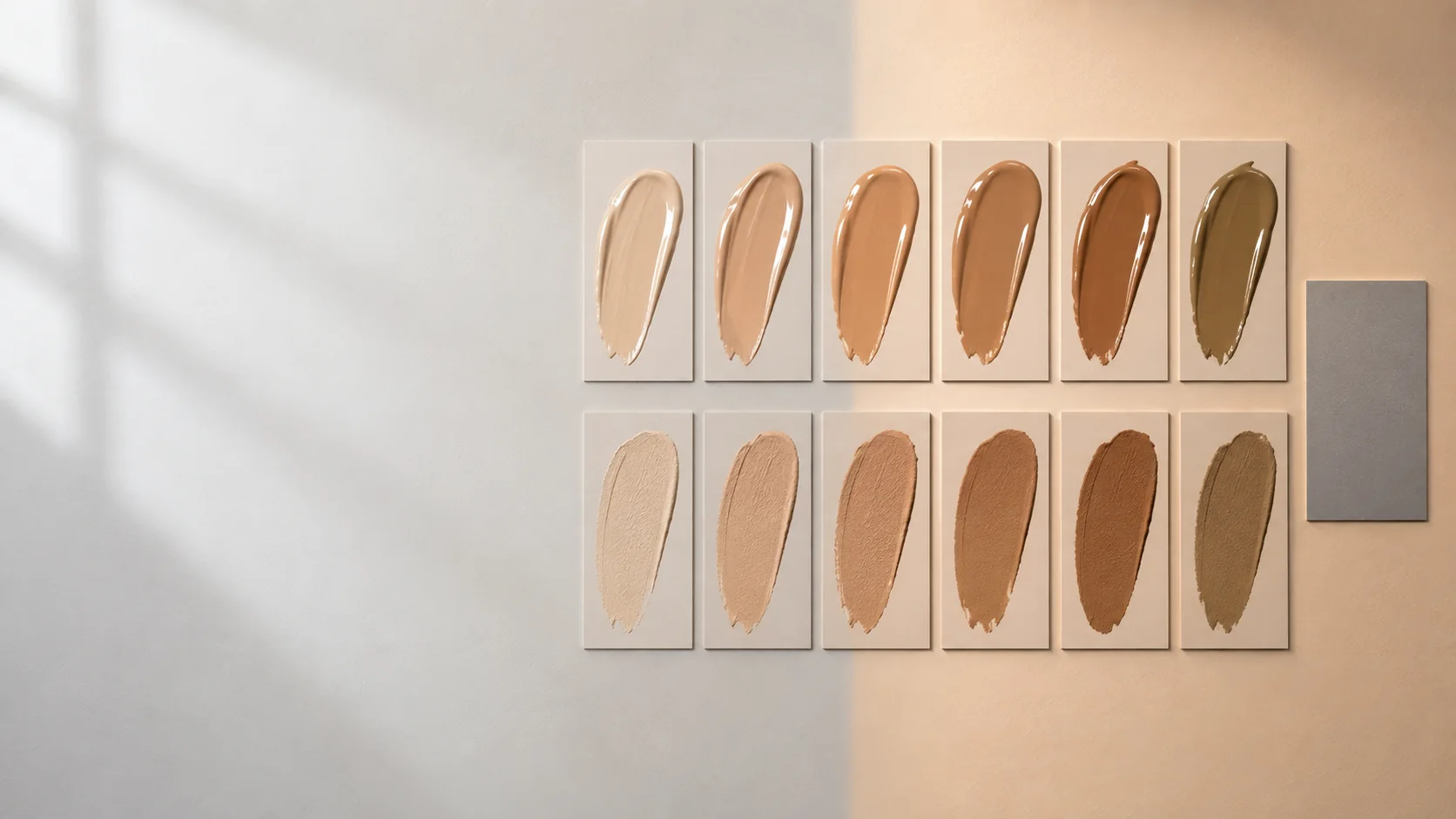
When a complexion match looks wrong, undertone receives too much blame. A shade can lean in the correct warm, cool, olive, or neutral direction and still fail because it is too light, too dark, too saturated, too muted, changed after dry-down, or was judged under misleading light. Diagnose these variables in order rather than turning the face into an undertone quiz.
Start with value
Value is perceived lightness or darkness. Squint at the jaw-to-neck transition or view a neutral photograph in grayscale. If the swatch forms a clearly lighter or darker block, solve that difference before making fine undertone corrections. Adding a strong color corrector to a value mismatch often creates a differently colored mismatch.
Use thin vertical swatches from lower cheek across the jaw where appropriate, not a hand swatch treated as a face match. Leave space between candidates so their edges remain readable. Compare with the neck and the intended finished area; bodies are not uniformly one color.
Then assess chroma
Chroma is color intensity. A foundation can have the right depth but appear orange, peach, pink, yellow, or olive because it is more saturated than the surrounding skin. Conversely, a shade can look gray because it is too muted or because its value is wrong. Compare against a neutral gray card in the frame—not to digitally color-correct the face, but to notice when the camera or light changes between tests.
Undertone is a direction, not an identity
Once value and chroma are close, observe the remaining directional bias. Compare two neighboring candidates rather than assigning yourself a permanent category. The useful question is “which adjustment reduces the visible boundary under the intended conditions?” Skin appearance varies across the face, seasons, lighting, surface redness, and pigmentation.
Wet versus dry
Make equal swatches and label the time. Photograph immediately, at five minutes, and at twenty minutes in fixed manual camera settings if possible. A visible shift may come from evaporation, film formation, pigment wetting, interaction with oils, or camera processing. “Oxidation” is often used as a catch-all; unless a chemical mechanism is established, call the evidence what it is: a measured dry-down color shift.
Repeat the test over the actual preparation you plan to wear. A swatch on bare skin cannot fully predict the same product over sunscreen, primer, or powder.
Light can reverse your decision
Judge the dry swatches in at least two relevant environments: indirect daylight and the indoor light where the makeup will be seen. Keep mirror surroundings as neutral as practical. Colored walls, clothing, and phone auto white balance can alter the comparison. Light sources with different spectral distributions can render skin and pigments differently; the CIE maintains formal methods for evaluating color rendition and measuring human skin color.
Do not use a single ring light as proof of a universal match. For an event or set, the target lighting matters more than an abstract ideal.
A diagnostic order that prevents overcorrection
1. Match value at the jaw/neck transition.
2. Compare chroma: too vivid, too muted, or close.
3. Adjust undertone direction only after the first two are controlled.
4. Record wet-to-dry shift at fixed intervals.
5. Recheck under target lighting and with a neutral reference in frame.
6. Inspect the complete film with powder and adjacent color products.
Correction should be measurable
Mix on a clean palette and record approximate ratios. Make the original and adjusted swatch side by side at the same thickness. A correction that works only because it sheers the product may have changed coverage rather than color. Repeat at the intended application thickness.
Evidence notes
- CIE publications and current standards on color rendition and human skin colour measurement
- FDA information on color additives in cosmetics
When the color decision is stable, the same hierarchy can be transferred into a design plan with From Reference to Face Chart.