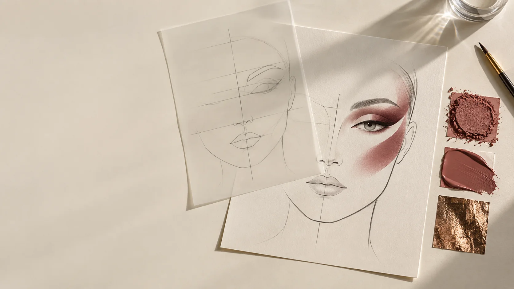
A reference image is evidence of one result on one face, under one lighting setup, lens, angle, and retouching process. Copying its visible coordinates onto another face usually weakens the idea. Translation begins by extracting relationships: what dominates, where contrast sits, which edges are controlled, and how the design responds to structure.
Begin with an inventory, not an imitation
Write down only what is visible before guessing products or technique.
- dominant shape and its direction
- highest-contrast boundary
- ratio of occupied to quiet space
- hard, soft, broken, or lost edges
- matte, satin, wet, metallic, or particulate surfaces
- color families and their relative value and chroma
- symmetry, deliberate asymmetry, repetition, and rhythm
- probable lighting direction and visible retouching uncertainty
This inventory separates the design logic from a product shopping list.
Identify the hierarchy
Choose the first, second, and third things the viewer should notice. If everything is reproduced at equal intensity, the translation loses hierarchy. A glossy lid, bleached brow, graphic mouth, and jeweled skin cannot all remain the primary event. Decide what carries the brief and subordinate the rest.
Convert the hierarchy into three face-chart values: full emphasis, supporting contrast, and quiet field. Test the chart first in grayscale. If the focal order disappears without color, placement or value may be doing less work than expected.
Normalize the proportions
Do not record “the line ends at this pixel.” Record relationships: the wing length as a fraction of eye width, the color field relative to the brow-to-lash space, or the cheek placement relative to the pupil and mouth corner. Then redraw those relationships for the new face, camera angle, and expression.
Mark anatomical anchors lightly, but do not treat them as rules. A hooded fold, deep-set eye, prominent orbital bone, or different lip volume changes what remains visible from the intended camera. The chart is a plan to test, not a promise that a flat diagram maps perfectly to moving skin.
Separate edge, texture, and finish
Three products of the same color can create different editorial statements through edge and surface alone. On the chart, annotate each zone with:
- edge: hard / diffused / broken / lost
- opacity: veil / layered / opaque
- surface: matte / satin / reflective / particulate
- application: press / sweep / stipple / draw / place
This vocabulary becomes a kit and lighting plan. A wet reflective area needs a camera and continuity strategy; a particulate surface needs fallout control; a hard graphic edge needs a correction method.
Account for uncertainty
A reference may contain color grading, retouching, compositing, or a light source outside the frame. Mark uncertain features rather than inventing certainty. “Possible highlight from lighting” is more useful than specifying a product based on a compressed image. Build a small physical test for any feature critical to the brief.
Make the translation original and lawful
Use references to analyze principles, not to reproduce protected expression. The U.S. Copyright Office notes that copyright owners hold the right to prepare derivative works, and that merely changing someone else’s work does not automatically authorize use. For commercial work, document licenses and permissions and seek appropriate legal advice where needed. A practical originality check asks: did we change the hierarchy, proportions, placement logic, color relationships, or material behavior—or only substitute a face?
Face-chart worksheet
1. Brief in one sentence.
2. Primary visual event.
3. Two supporting decisions.
4. Quiet areas that protect the hierarchy.
5. Placement ratios and anatomical anchors.
6. Edge, opacity, texture, and finish notes.
7. Lighting and camera assumptions.
8. Two technical risks and small tests.
9. Changes that establish a new design rather than a copy.
10. Removal, continuity, and reset plan.
Evidence note
See the U.S. Copyright Office overview of copyright and its fair-use FAQ. This article provides a design workflow, not legal advice.
For reliable color decisions in the chart, use the sequence in Undertone Is Not Enough. For the boundary language used above, see Edge Control.