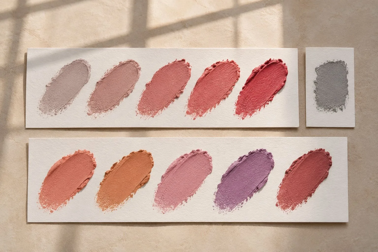
The difference between hue and saturation is the difference between which color a product is and how strongly that color appears. A foundation can be the right depth but the wrong hue—too pink, yellow or olive. It can also sit in the right hue family but look too saturated against the skin, as if the color arrives before the face. Value is the third axis: how light or dark the mixture appears. Diagnose all three before reaching for a corrector.
Hue, saturation and value in one minute
Hue names the color family: red, orange, yellow, green and the positions between them. In makeup work, hue appears in undertone judgments such as rosy, golden, peach or olive, and in the direction of a blush, lip or corrector. A hue shift changes the family itself.
Saturation describes the intensity or purity of that hue. A highly saturated coral reads vivid and color-forward. A lower-saturation coral contains more neutral or grey influence and appears muted, even though it remains recognizably coral. Saturation is also called chroma in many practical color discussions; the concepts are closely related, although technical color systems may define their measurements differently.
Value describes lightness and darkness. Two products can share a hue and similar saturation while one is visibly deeper. A shade that is simply too dark will not be corrected by adding an opposite hue. The diagnostic framework in undertone, value, chroma, oxidation and light shows why these axes should be evaluated separately.
How a wrong hue looks on skin
A hue mismatch creates a directional cast. A complexion product may read distinctly pink against a neck that appears more golden, or yellow against skin that reads rosy. On some complexions, a base with too much orange or pink can erase an olive quality and produce a conspicuous warm mask. The border between swatch and bare skin often makes the direction easier to see than the center.
Do not diagnose from the product in its container. Film thickness, surrounding colors and the product's wet state can alter perception. Place a controlled swatch near the intended area, let it reach the stage at which you would judge it, and compare it with nearby skin under neutral daylight. If the swatch is consistently shifted toward a different color family while its lightness appears plausible, suspect hue.
A wrong hue can still be low in saturation. A greyed pink remains pink; it is merely muted. This is why “too pink” and “too strong” describe different problems and require different corrections.
How wrong saturation looks
When the hue direction is credible but the swatch looks too colorful, saturation may be too high. The product can appear detached, theatrical or unusually clean in color compared with the more complex mixture visible in skin. A highly saturated peach corrector, for example, may remain obvious after the discoloration has been neutralized because its intensity exceeds what the surrounding area can absorb visually.
When saturation is too low, the swatch may look grey, dull or ashy even when its basic hue points the right way. This is not always a color error; excessive powder, dryness, texture and lighting can also create a chalky impression. Compare equal film thicknesses before attributing the effect to pigment balance.
Keep value separate. Adding white to lighten a mixture can also make it appear chalkier, but the intended correction was value. Adding a deep neutral can lower value while also muting color. Mixing changes several properties at once, so test the result rather than assuming a single-axis move remained pure.
Diagnosing a swatch
Use a repeatable comparison rather than judging from memory.
1. Work in indirect daylight or another neutral, consistent light. Remove strongly colored objects from the immediate field if they cast light or influence perception.
2. Place a neutral grey card beside the skin area, not over it. The card gives the eye a stable reference and helps reveal a warm or cool lighting cast; it is not a target skin color.
3. Apply two or three swatches at the same thickness with clean tools. Keep one original and use the others for controlled corrections.
4. Wait until the product reaches its normal judged state. Some films change as volatile components leave or as they interact with skin, so compare at the moment relevant to the job.
5. Check value first by narrowing the visual field or viewing from a short distance. If one swatch is clearly lighter or darker, correct that before making a fine hue judgment.
6. Check hue at the edge: does the swatch pull pink, yellow, orange or olive relative to nearby skin?
7. Check saturation: if the hue direction fits, does the color still look too vivid or too grey?
8. Record the smallest useful adjustment and reproduce it on a fresh swatch. The method in from reference to face chart is useful when documenting a controlled color decision.
Corrections in practice
To shift hue, add a very small amount of a mixer that moves the product toward the missing direction. A base that looks too pink may need a yellow, golden or olive adjustment depending on the skin reference; there is no universal single corrector for every “too pink” result. Mix on a sanitized palette, preserve an untouched control swatch, and compare equal films. Stop when the hue aligns—before the corrector becomes a visible new color.
To lower saturation, introduce a controlled amount of a neutral or a near-complementary color. A true complement can neutralize quickly and may also darken or dirty the mixture, so approach it in small increments. In complexion work, using a muted product in the same general hue family can be easier to control than adding a strong opposite.
To raise saturation, add a more saturated version of the same hue direction rather than simply adding more of the original product. More product mainly changes film thickness and coverage. A concentrated mixer changes the pigment balance, but it can also shift value, texture and wear, so keep the adjustment small and test the finished film on skin.
Correction is successful when the altered swatch solves the diagnosed axis without creating a new mismatch. Keep the original beside it, use the grey reference, and change one decision at a time. That turns color correction from an intuition-only exercise into a comparison you can repeat.